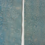
I am experimenting with salt printing for the first time as I try to figure out a cover decoration solution. Ultimately, I would like to use salt prints as a more central part of my content in the future, but for now, I am trying to use them as an alternate way to incorporate color. I first learned about the salt printing process at the Guild of Book Workers Standards of Excellence last year in San Francisco. Carolee Campbell demonstrated her use of salt prints in a recent book called The Persephones. Her use of ink and salt creates unique, rich spreads in her book without distracting from the rest of the content.
Before delving into my results, it would be helpful to provide a quick explanation of how a salt print is made:
Brush water based paint or ink onto a piece of paper
While it is still wet, sprinkle salt across the page
After it is dry, scrape the salt from the surface
The remaining “print” from the salt is a result of the salt reacting with the water during the drying process
I wasn’t totally sure what I wanted from the salt prints, so to begin, I just wanted to do a little testing. From what I learned, one can get a variety of results just by changing a few elements of the process. So I tried out both coarse kosher salt and finely ground iodized salt. Other factors you can change along the way include the amount of water in the ink or paint as well as the volume of salt sprinkled in any given area.
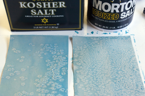
Below are some images from my first test.
After seeing the difference of the coarse Kosher salt (a larger, more pronounced pattern) versus the small grains of the Iodized salt (a more delicate, detailed result), I will do the cover decoration with the Kosher salt. I’ll do a round of cover papers next and see if there are any other factors that will come into play.
