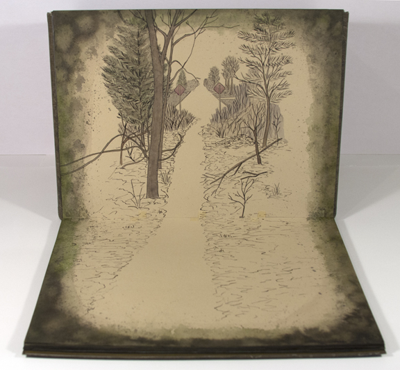
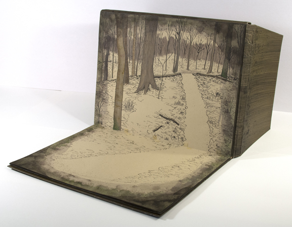
Undefined Lines is the result of the Guild of Book Workers Horizon exhibit competition. Entries could be any type of binding, artist book or other book project so long as it related to the theme “Horizon.” It had been a more difficult topic for me to respond to than others in the past; the decision process was incredibly drawn out and the number of times I changed my mind about the design was a personal record.
When I was contemplating the thought of “horizons” I eventually realized that I literally walk a horizon line nearly every day. Inspired by the hike I take in the woods near my house, I decided to illustrate the path I walk, a place I physically go to in order to work out the intangible.
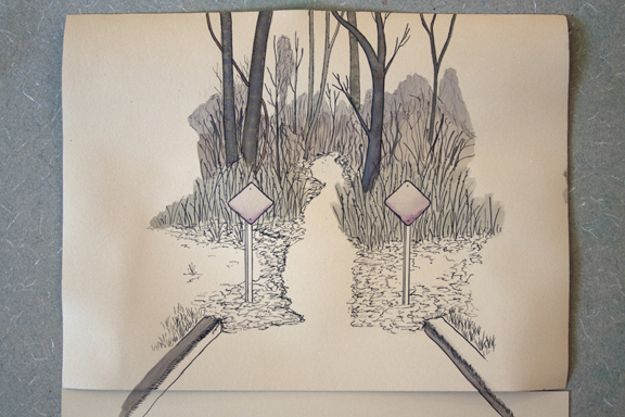
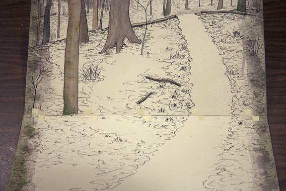
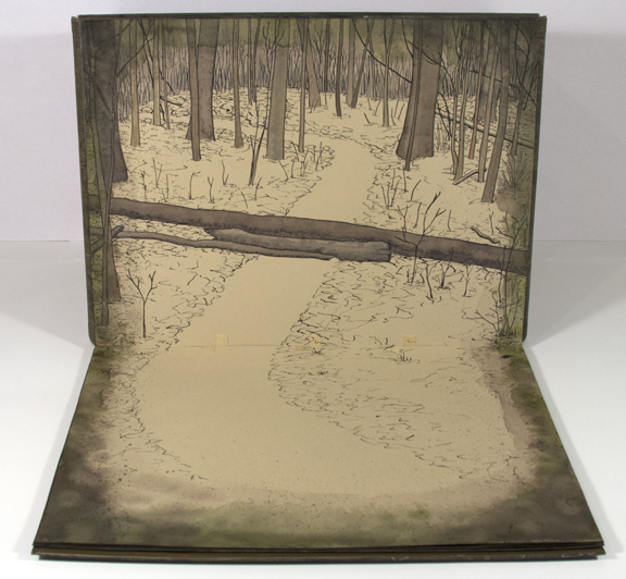
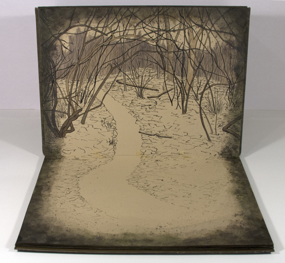
I began the process by making several sketches from the photos I took while hiking the path. Using a tan colored Rives BFK, I used a nib dip pen and India Ink to make the black line of the image. Once I had all the images drawn, I thought more about what I wanted them to feel like. I decided that there needed to be a feeling of depth and space that the black line didn’t achieve on its own so I added watercolor to certain areas. Still not satisfied with the simulated dimension, I chose to extend the image on to another page below it (this meant that each page would have imagery on two sides). This was the first step in deciding how the series would be bound together.
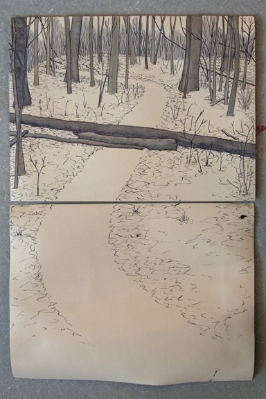 After extending the imagery down to a second page, I had decided that the binding structure needed to allow the “top” page to stand up. This would help the illustration on the bottom facing page invite the viewer into the book. It occurred to me that it wasn’t enough to invite the viewer in, but also to make the viewer feel like they were viewing a private space alluding to a private experience. So, I added a perimeter of marks with watercolor and ink.
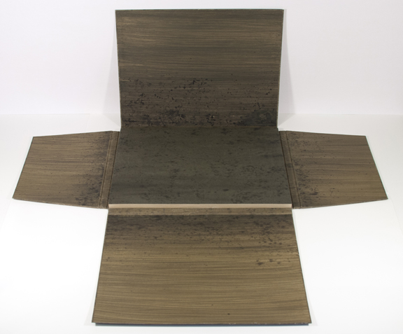
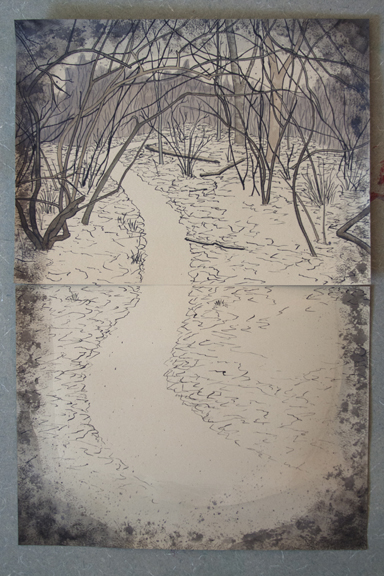 The next step was to determine the method of binding. So far I decided the book should have the ability to be propped up and the imagery should fold down towards the viewer so that the images could be revealed in order. With a few ideas in mind, I made several mock-ups of a wrapping cover that could fold back on itself with spare board. Once finalized, I had to figure out just how the single pages would be sewn together. Remembering the woven structures of Claire Van Vliet, I decided to weave tissue, through horizontal slits in the pages, which were toned to match the color of the Rives. The image below shows the woven tissue before it was matched to the surrounding marks.
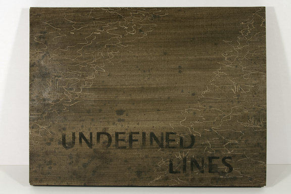
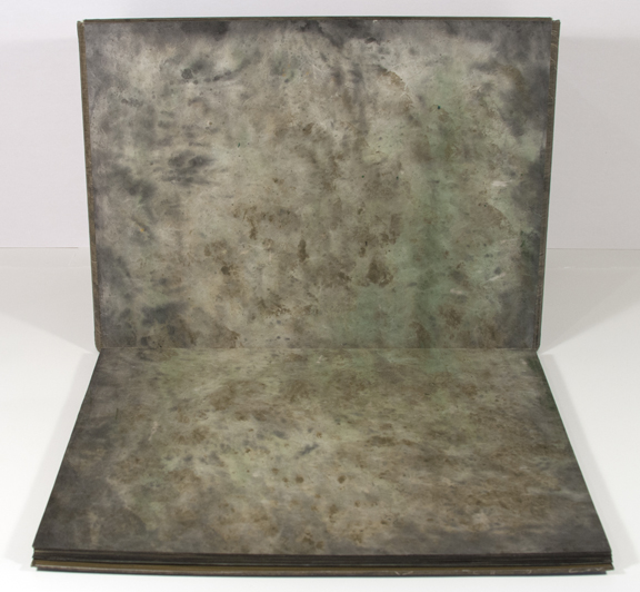
Next, I set to making the material for the cover. Again, I turned to paste cloth. With the interior of the book containing drawings and watercolor painting, I thought that the cover material needed to be complimentary to the marks inside and fully customizable.
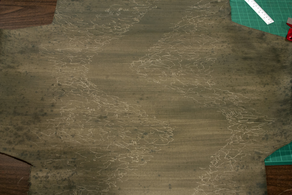 I used a piece of cloth cut in a T shape to accommodate the portfolio style wrapping cover. The surface design was built up with several layers of paste and paint, then decorated with lines drawn in the wet paste with a stylus. Spattered ink was also added while everything was still wet.
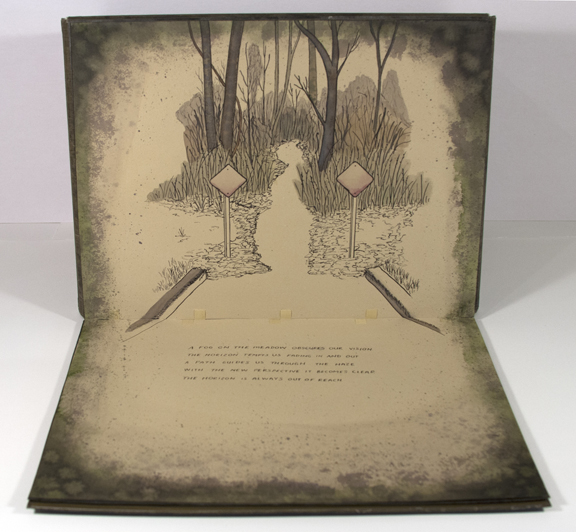
Just before assembly was finished, I decided that the book needed a few lines of text to set the tone of the images that were to follow.
A fog on the meadow obscures our vision
The horizon tempts us fading in an out
A path guides us through the haze
With the new perspective it becomes clear
The horizon is always out of reach
Below is the finished piece beginning with the book closed, a few of the spreads inside, and and ending with the book open so you can see the cover structure opened upright.
